Categories
Landing Pages Marketing

These Thank You Page Best Practices Will Help You Move Leads Down the Funnel

lead funnel

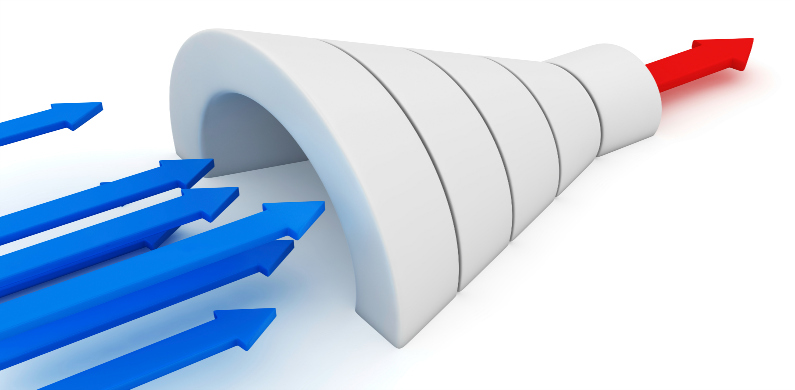
In our last post, we discussed best practices for a landing page that will successfully convert leads. Once your leads click on your ad and submit your form to receive whatever offer you’ve advertised, they should be directed to a well-designed thank you page.  A thank you page let’s the lead know their request has been received and allows your brand to have another opportunity for conversion.

The following are best practices for content to be included on your thank you page:

1. Clean Design

Just as you should have done in your original landing page, make sure your thank you page is clean and easy to navigate. Your visitor should not be confused on what their follow-up options are. Also make sure the branding and design matches that of the original landing page. The ad to the landing page to the thank you page should all read like a story.

2. Remove Distractions

Once your lead has converted and been directed to the thank you page, you want them to take some other action that will force them to continue to interact with your brand. Take out links to the homepage, or the like, which will not do anything to assist you in converting the lead in any other way.

3. Confirm the Submission

Make sure the user knows that your business has received their form and you are taking the next action, whatever that might be. Let them know the form has been submitted and either they will be contacted, their order will be shipped, or some follow-up will occur after this.

4. Include a Relevant Offer

Think of your thank you page as another landing page, and another opportunity to make a conversion, as mentioned above. If you are an affiliate marketing company and your original offer was a discount on signing up, you should include a link or on-page ad to a “refer a friend” commission, or something else that would be relevant to the offer they just acted on. Other ideas for additional offers include webinars or coupon codes for other products.

5. Tell Them Why to Follow Your Social Accounts

It’s all well and good to include links to your social accounts and hope that people click, but why not give a little push to increase your chances of gaining likes and followers? By including larger social icons with blurbs that mention why they should follow you on social and what kind of content they will see from you, they may be more inclined to click. For example, if you are a domain registrar and this lead just converted on an offer for a discounted domain name, they may be interested in how to design their website or want to learn about simple social media tips to increase traffic to their new site. Letting them know that this is the kind of content you post about on social will be much more likely to get them to follow than simply placing a link to your twitter account.

6. Include Value Added Blog Content

The same concept from above applies to this best practice. Offering free content on subject matter that would interest your lead will allow them to get to know and trust your brand more. If your social accounts post about various categories this lead cares about, they will most likely also care about the original content being created and posted on your blog. Choose to include a blog post that is, again, relevant to your initial offer – make your story continue.

7. Ask them to Subscribe

Let the lead know what kind of content they can expect to receive if they sign up for your email newsletter and provide a simple email submission form to close the deal. From your end, you make sure your drip marketing campaigns provide interesting, trustworthy content that would apply to your leads, no matter where they are in the funnel. Remember, you should use your email marketing to push leads like this down the funnel to make them a customer.

8. Try Including a Video

Videos generally get very high click rates on thank you pages. At this point we can assume the lead is interested in your brand or type of product based on the fact that they submitted your form to receive your offer. This lead is most likely interested in learning more about your brand, how your products work, more details on the offer, or something in that realm. Remember, the idea is to keep this lead engaged with your brand for as long after conversion as possible.

9. Show Off Your Social Proof

Including reviews from current and previous customers, bloggers, reliable news or online sources is an awesome way to seal the deal with your lead and increase their trust with your brand. People like to know how others like using a product or service and will often be more likely to complete a purchase if they see the product got great reviews from others that used the product or service. “As seen on” images, such as “As Seen on The Today Show,” or “Dr. OZ,” also work as wonderful social proof on a landing page.

10. Let Them Share

Ask visitors to share the offer on their personal social channels or via email. Using the same concept from above, but to an even higher degree, someone will be more likely to make a purchase if someone they know personally has actually emailed them an offer with the assumption that the person they are sending to would be interested in it.

BONUS: Send an Auto Confirmation Email

Make sure you set up an auto-responder email to confirm submission of a form and thank the lead for their interest. This email is an entirely new blank canvas with even more chances to convert a lead in different ways. Include any of the best practices above that you didn’t have room for on the original thank you page, or include the same best practices with different content! The point is not to waste an opportunity to touch a lead an additional time and get them to engage with your brand further.

Remember to keep your design clean and your paths to conversion easy for your user to understand. In other words, you probably won’t be able to use every single best practice on every thank you page. Choose the ones that are most relevant to the original ad and landing page, and whichever ones align with your most important conversion goals at the time. It’s also a good idea to test different thank you pages to see which content resonates better with your leads.

What did we miss? What is you “must have” piece of content on your thank you page? Let us know in the comment section…
 

Are you interested in earning a second income while working from home?

affiliate marketing

Categories
Landing Pages Marketing

2015 Best Practices for Landing Pages that Convert

landing page best practices 2015


So, you got your target customer (we hope,) to click your offer or ad – now it’s time to make sure you close the deal and get their info. Whether you’re goal is to collect an email address, garner a subscription to your blog, or have your customer complete a download, etc. the second most important part of that process, after creating an effective ad or offer, is the effectiveness of your landing page.

There are many reasons a lead may click the ad and then fail to complete the landing page form, but listed below are some best practices you should follow in order to design landing pages that convert.

1. Consistent with the source

The “one size fits all” method that many people use for landing pages is simply not effective anymore. Your offer, writing style and design should be consistent with the channel it is being displayed on. For example, if your offer is a discounted price on an affiliate marketing membership being shown on Facebook, your landing page should reflect that. You would want to use more casual, peer style writing than you would if your offer were a whitepaper download coming at the end of a Forbes magazine article. Also, make sure to use some of the exact language you had in your ad from the original channel in your landing page. This reassures the lead that they have clicked into the right place and it’s the page they want to be on. 

2. Take audience into account

Each channel you use to advertise can potentially have different audiences viewing your content. The style of copy, design of the landing page, and content on the page should always be tailored to fit the type of person clicking your offer and the channel that they came from. Who did you target in your ad or offer? What kind of content resonates well with them? Your landing page should reflect the “mindset” of your lead based on your targeting and where they clicked over from.

3. Closes the deal

Use clear and concise sales language in your landing page. Your lead wants to know exactly what your offer is, why they should want it, and what they can expect after submitting the form. Bullet points and check marks come in handy here. Use strong, action language, like “download the guide,” or “get a call from one of our experts,” to ensure the lead understands what the exchange of information is for.

4. Shortest form possible

The process of landing page completion should be as painless as possible for your viewer. Extensively long forms are an enormous deterrent for leads, and increase the chances of abandonment. Only require the fields you absolutely need from this person in order to get in contact with them, nurture them, or get them what they need for the offer they clicked on. One other option if you absolutely have to have a long list of form requirements is to have multiple parts, or a form that builds. Once you receive one or two of the form fills, then they move on to the next part of the form. However, avoiding a long form is always the best option.

5. One clear CTA

There is nothing worse than a landing page that has so many calls to action that the lead doesn’t know which one to click first. Make this as easy a path as possible for your potential customer. They should know exactly where the CTA button is immediately upon opening the landing page; in addition to what they need to do (i.e. fill out the form) and what they are getting in return. The CTA should look clearly like a clickable button, should stand out against the rest of the page, and should use action language. Examples of good CTA’s include: “Download Now!” – “Get My FREE Quote!” – “Sign Me Up!” – etc.

6. Limit Distractions

Too many links, buttons, images, and the like, floating all over the landing page simply distract the lead from what you actually want them to accomplish while on the page, which is filling out your form. The more opportunities they have to click out of the landing page, the more you are increasing your chance of the form never being completed by a potential lead. Save the social links, blog posts, and homepage links for the Thank You page, once the lead has already submitted their info.

7. Urgency is a plus

If it makes sense to include verbiage such as “limited quantity,” or “limited time offer,” do it. It’s marketing 101 knowledge that urgency can increase the chance of your sale based on consumer psychology. It won’t make sense to include urgency on every offer or landing page, but is a great option if you are able to make it relevant.

8. Contrasting colors

Using contrasting and complimentary colors throughout your page is the best way to direct your visitor’s eyes on the particular path that you want them to follow. Contrast in colors makes the copy easier to read, makes the CTA really pop off the page, and is simply aesthetically pleasing to the eye. For example, an orange CTA button looks great when the entire page uses muted blues and whites. Your visitor’s eye is automatically drawn to the one color that stands out above the rest.

9. Limited Copy

Again, you want this process to be easy and painless for the lead – you don’t want them to feel overwhelmed by two large paragraphs they feel they have to read before filling out a form and giving you their information, and instead decide to abandon the page. A heading which reassures them they are one step away from redeeming the offer they clicked on, a sub heading, and a few bullets should be enough to explain again, after having already seen your ad and been interested in the offer, to the lead what will happen once they hit that submit button.

10. Responsive design

Always remember that your landing page needs to look just as clean and well designed on a mobile device as it does on a desktop computer. In fact, it would behoove most marketers to put more emphasis on mobile devices than desktop, as mobile is quickly becoming the primary viewing device for most people. Make sure your template and design stacks your content the best way possible, and that your form is always above the fold. Do not force your lead to scroll, or potentially click out because they don’t even know there is a form to fill out below the fold.

The best practices listed above will help you to ensure you are designing landing pages that convert leads into customers. However, the channels used, quality of your ad or offer, and a number of other factors go into the success of a campaign. Stay tuned for next week’s article regarding best practices for “Thank You” pages.


Are you interested in earning a second income while working from home?

affiliate marketing